
Understanding Mobile User Behavior: How People Interact, Decide, and Convert on Mobile
Understanding mobile user behavior means recognizing how people browse, search, compare, and take action when using smartphones or tablets. Mobile users rarely behave exactly like desktop users. They are often moving, multitasking, dealing with smaller screens, and expecting information almost instantly.
For marketers and website owners, these differences matter. A page that performs well on desktop can still frustrate mobile visitors if navigation is difficult, content takes too long to load, or important information requires excessive scrolling. Understanding these patterns helps businesses create better experiences and guide users toward the actions that matter.
How Mobile Users Browse and Make Decisions
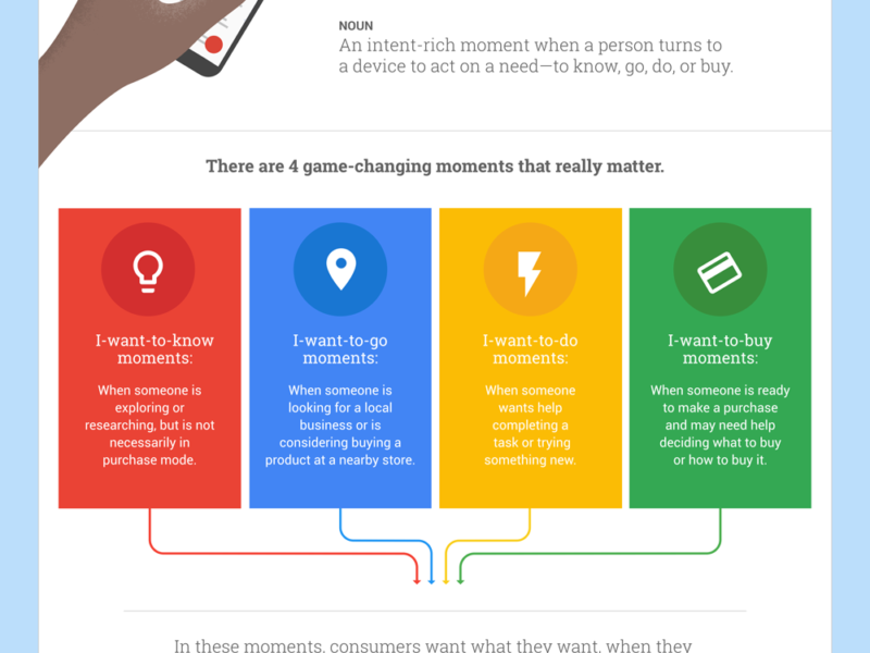
Mobile interactions tend to be quick and purpose-driven. Someone searching for a nearby restaurant during lunch, for example, probably wants an address, menu, reviews, and directions immediately. They are unlikely to patiently explore several complicated pages.
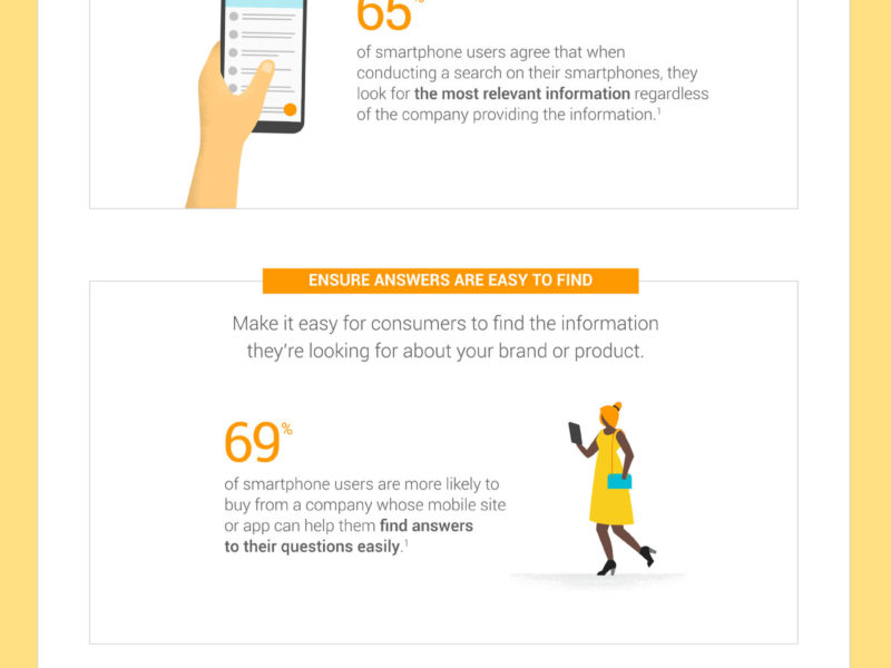
In practice, users often scan rather than read every sentence. Clear headings, short paragraphs, visible buttons, and straightforward navigation make information easier to process. This aspect of mobile browsing behavior explains why simplicity frequently performs better than visually complicated layouts.
Context also affects decisions. A person browsing a product from their sofa may spend several minutes comparing options, while someone standing inside a store might search for a specific review or price comparison and make a decision within seconds.
A common mistake is assuming that a responsive website automatically provides a good mobile experience. Responsive design helps pages fit different screen sizes, but businesses must also consider speed, readability, button placement, forms, and user intent.
Tools such as Google Analytics and Microsoft Clarity can help reveal what visitors actually do. Analytics data may show which mobile pages have high exit rates, while session recordings or heatmaps can highlight areas where visitors struggle to navigate or interact.

Practical Ways to Improve the Mobile Experience
The goal is not simply to make a website look attractive on a phone. It should make the user’s next step obvious and easy.
Consider focusing on:
- Improving page-loading speed and removing unnecessary elements.
- Placing important information near the top of the page.
- Making buttons large enough to tap comfortably.
- Simplifying checkout, registration, and contact forms.
- Testing pages on real smartphones instead of relying only on desktop previews.
These improvements support a stronger mobile user experience because they remove friction between what visitors want and what the website asks them to do.
FAQ About Understanding Mobile User Behavior
Why is understanding mobile user behavior important?
It helps businesses design websites and marketing campaigns around how people actually use their devices. When visitors can quickly find information, complete forms, purchase products, or contact a company, they are more likely to remain engaged and convert.
Understanding behavior also prevents teams from making decisions based only on assumptions. Real data can show whether visitors abandon a page because of slow loading, confusing navigation, lengthy forms, or poorly positioned calls to action.
How can businesses analyze mobile user behavior?
Start by reviewing device-specific data in analytics platforms. Look at engagement, conversions, popular pages, traffic sources, and points where visitors leave.
Then combine quantitative data with observation tools such as heatmaps and session recordings. Numbers may reveal that users are abandoning a checkout page, while recordings can help explain why. The most effective approach is to test improvements regularly and compare results rather than relying on a single redesign or assumption.